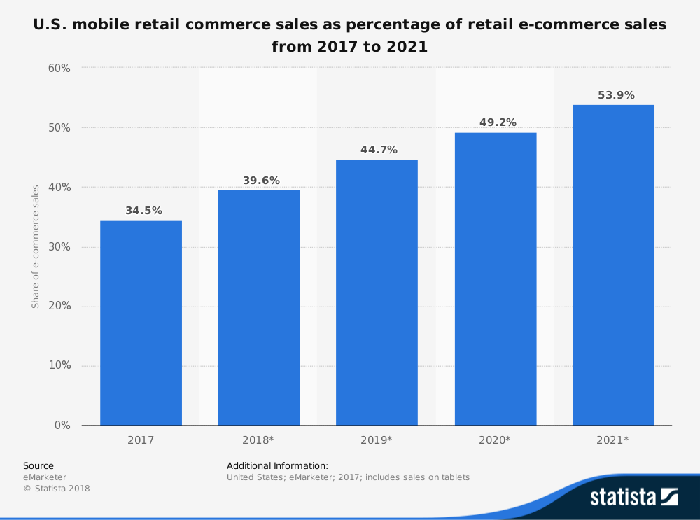
Your mobile checkout process can account for a third of your online orders to your merchant account. That’s because smartphones continue to be the predominant device for browsing, especially in the e-commerce space. In 2017, internet purchases via smartphones were 34.5% of total online sales. By 2021, this buying channel is expected to top 54% of all e-commerce sales. Furthermore, mobile commerce transactions account for nearly 60% of digital orders for a total of $1.357 trillion.
As you can see, the checkout process is a critical component of the online experience for an e-commerce business. With these stats on mobile, you cannot ignore the importance of the mobile checkout process. This is clearly showing that online businesses, especially high-risk ones, need to pay extra attention to these changing trends in user behavior.
But, given all this, conversion on handheld devices has consistently ranked lower than on desktop. Smartphone shoppers are more likely to abandon their shopping carts than desktop users. That’s much more money being left on the table – or on your potential customers’ smartphone – to tap into. One of the most effective ways to start improving your conversion rates is adopting a fully optimized mobile checkout page.

Mobile vs. traditional desktop checkout page – what’s the difference?
Shoppers who use smartphones and tablets have unique experiences compared to desktop users. They are often trying to do multiple things at once or attempting to shop while on the go. This means the checkout process must be designed to accommodate these unique issues. This includes things like speed, or the margin of errors from using thumbs and fingers as opposed to a mouse.
Take for example dating apps. These are primarily used on mobile. As such, you need your conversions to also be on smartphone. If your mobile checkout process is difficult or there are barriers preventing a seamless conversion, your dating app will be losing potential paying customers.
Dos and don’ts of designing your mobile checkout page
Improving your checkout page can take some work, and we have several recommendations for you to do so. You can start with these three below and then incorporate the mobile checkout page optimization recommendations here.
- Ensure the page is smartphone-friendly
If you have not yet, you need to ensure that your page is optimized for handheld devices. With Google’s mobile-first indexing, sites optimized for smartphone browsers will influence preference in search rankings.And, in terms of user experience, pinch and zoom will cost you with high bounce rates and loads of cart abandoned issues. - Make the checkout process simple
Remove any distractions and make it easy for persons to click and complete their purchase. This includes allowing persons to check out as guests should they want to do so. Forms should be simple to use, read, and fill out. Buttons should be easy to access and use. - Make security a priority
Perceived lack of security is one of the main reasons why people abandon transactions on their smartphones. So, make sure your website and checkout page are using SSL encryption. Add trust icons such as the padlock icon in the address bar or the Norton or similar logo on the checkout page to show your commitment to security.
Ideal tools to secure your mobile checkout page
As an e-commerce business, one of the issues you have to deal with is fraud and keeping your chargeback ratios low. This is necessary to maintain a good relationship with your merchant services provider. So, while you’re improving the checkout process for cell phone users, make sure that you are also putting systems and tools in place to prevent or limit fraud and chargebacks. Neglecting this area of your business could lead to your accounts being terminated.
Improving your authentication process can start with installing a 3D Secure 2.0 (3DS2) application suite on your system to protect card transactions. (You can contact us for more information on what this is and how you can use it for your business website.)
What can you do to improve your mobile checkout process?
Thinking of adding a mobile checkout? Then you can start by ensuring some of the recommendations we made are implemented on your site. Then, find a partner like DirectPayNet Payment Solutions that specializes in resolving payment issues, especially for high-risk merchants like yourself. As your merchant services partner, we’ll help you build, launch, and grow your e-commerce company in ways others can’t.
The simpler the checkout and payment process, the more conversions, sales and repeat business you’ll have. If you have more questions about our process for helping you to improve your customer’s mobile checkout experience, or, if you would like to get approved for your next merchant account today, then get in touch.


